Saturday, August 6, 2022

Saturday's postcard: Dinosaurs and a doggy overlooking South Dakota

This undated (but probably 1950s or earlier) postcard shows a pair of dinosaurs and a dog (for scale) overlooking Rapid City, South Dakota. It's a "Natural Color Post Card" made by E.C. Kropp Co. of Milwaukee, and it was published by Johnston & Bordewyk of Rapid City.

I've featured a bunch of E.C. Kropp postcards on Papergreat over the years; you can use the search bar to track down the other ones. In 2015, I quoted some historical information about Kropp from metropostcard.com page that is no longer on the internet. So much for the knowledge being housed in perpetuity here. Here's that history again:
The company "began producing chromolithographic souvenir cards and private mailing cards in 1898 under the name Kropp. These cards were of much higher quality than those that would printed under the E.C. Kropp name. They became the E.C. Kropp Company in 1907 and produced large numbers of national view-cards and other subjects."
Dinosaur Park, which was dedicated in 1936, is one of the oldest dinosaur-themed attractions in the United States, and it's still around. According to Wikipedia, it was "created to capitalize on the tourists coming to the Black Hills to see Mount Rushmore" and constructed jointly by Rapid City and the Works Progress Administration (project #960). 

In a paper titled, "Works Progress Administration Projects in Rapid City, South Dakota," Kathy Bunkowske writes that "R.L. Bronson, secretary of the Rapid City Chamber of Commerce, first propositioned the idea of a Dinosaur Park to federal agencies after visiting the Chicago Century of Progress Exposition and viewed a mechanically operated reproduction of a brontosaurus. The government approved the five prehistoric sculptures, Triceratops, Triconodon, Brontosaurus, Stegosaurus, and Tyrannosaurus Rex, allowing WPA Project 960 to begin excavation work in March, 1936."

Emmet Sullivan was the designer and superintendent of construction, and Bunkowske notes that "the project suffered a serious setback when Sullivan resigned as project foreman and left with the teeth belonging to the Tyrannosaurs Rex."

Two more dinosaurs were later added to the original five. Wikipedia notes that the statues were originally gray, but "but by the 1950s the statues were painted bright green with white undersides."

RoadsideAmerica.com notes that Dinosaur Park is "probably the only dino park that encourages kids to climb on all its displays. This may also explain the rounded and worn edges." 

It should also be noted that the park, as you can perhaps tell from his postcard, sits atop a hill that can only be reached via a steep set of stairs, creating accessibility issues. Those have persisted for decades. But it was reported this past February that bids were being sought on a project that would bolster inclusiveness for those who wish to visit this historic attraction.

Thursday, August 4, 2022

Scholastic book: "27 Cats Next Door" (aka I feel seen)

When I was scanning my shelves looking for something to write about it, this one jumped out at me. Gee, I wonder why. When I originally placed this book on the shelf, we only had four cats. Now there are 17 cats in the house and three additional outdoor cats that we take care of. (Indeed, I had to pause while writing this to feed Big Boi.) We are frighteningly close to being the "next door people" in the title of this book.  
  • Title: 27 Cats Next Door
  • Author: Anita Feagles. Her name is misspelled as Anita Fleagles on the cover. Her full name is Anita Marie MacRae Feagles, and her other books included Casey: The Utterly Impossible Horse; The Tooth Fairy; He Who Saw Everything: The Epic of Gilgamesh; Queen Sara and the Messy Fairies; The Year the Dreams Came Back; and The Monster, Mr. Nelson.
  • Illustrator: Barron Storey. Interestingly, his name is misspelled too, being listed as Baron Storey on the title page. Storey mentions 27 Cats Next Door briefly in this 2014 interview with Aaron Silverberg about his career and artistic style.
  • Publisher: Scholastic Book Services (TW 881)
  • Year: 1966
  • Pages: 64
  • Format: Paperback
  • Chapter titles: Too Many Cats Next Door; A Cat Named Philip Rogers; And Twenty-Six Others, More or Less; The Cat That Tripped Mrs. Bolton; A Petition Against Cats; A Secret Plan; How It Feels to Be Without Friends; Still Too Many Cats; A Home for a Kitten.
  • First sentence: "Moving to a new town wasn't nearly as bad a Jim had expected."
  • Last sentence: "And he was right."

This isn't really a happy book. It's mostly sad. The teenager, Jim, discovers that his neighbor, Mrs. Ames, is essentially a cat hoarder. And that's not really a socially acceptable thing, then or now. Most people consider it weird, at best, and a public health nuisance, at worst. Mrs. Ames doesn't have any friends or help with her collection of cats and, while Jim admirably tries to assist her, he's quickly in over his head, too. They two of them can only try their best.

They don't even have the resources that might be available today to keep a stray cat colony from spiraling further out of control. Trap–neuter–return (TNR) programs weren't widespread in the United States at that point. Euthanasia at the SPCA was the only practical solution, and neither Mrs. Ames nor Jim want to see that happen.

Here's a passage from early in the book:
Jim wished he could tell Mrs. Ames that if she had fewer cats, people wouldn't say mean things about her. He said, "Maybe it would be better if you didn't have so many. If you gave them all away except for, say, three, maybe it would ... well, maybe it would be better." 

Mrs. Ames gave him a funny look. "People have been telling me that for years. But nobody will take care of them if I don't. Of course everyone thinks I'm very strange because I don't like to see animals die. I probably am."
A few pages later, Jim and his less-than-understanding father have this conversation:
"How do they kill them?" Jim asked.

"They put them in a gas chamber. They feel no pain at all. There are too many cats in the world, Jim, and some people turn them loose to starve to death. Some people drown them. Is that kinder than putting them in a gas chamber?"

"In school we're learning that pretty soon there will be too many people in the world," Jim said. "Are we going to put them in a gas chamber too?"

"Oh, come now," his father said. "People are more important than cats."

"Not to Mrs. Ames," Jim said.
In her 2008 mini-review of 27 Cats Next Door on GoodreadsKrista the Krazy Kataloguer sums up the book's big issue succinctly: "Sometimes there are no easy solutions to problems!"

That's true. But I'm fully on Team Mr. Ames. In 2022, we seem to be surrounded by overwhelming problems that no one person or family can possibly tackle: global warming, war and genocide, gun violence, gaslighting of the public to undermine any number of truths. If, to counter all this stress, we choose to put some of our finite energy and compassion toward helping cats, or any other animals, I think that's a noble use of our time here on Earth.

Tuesday, August 2, 2022

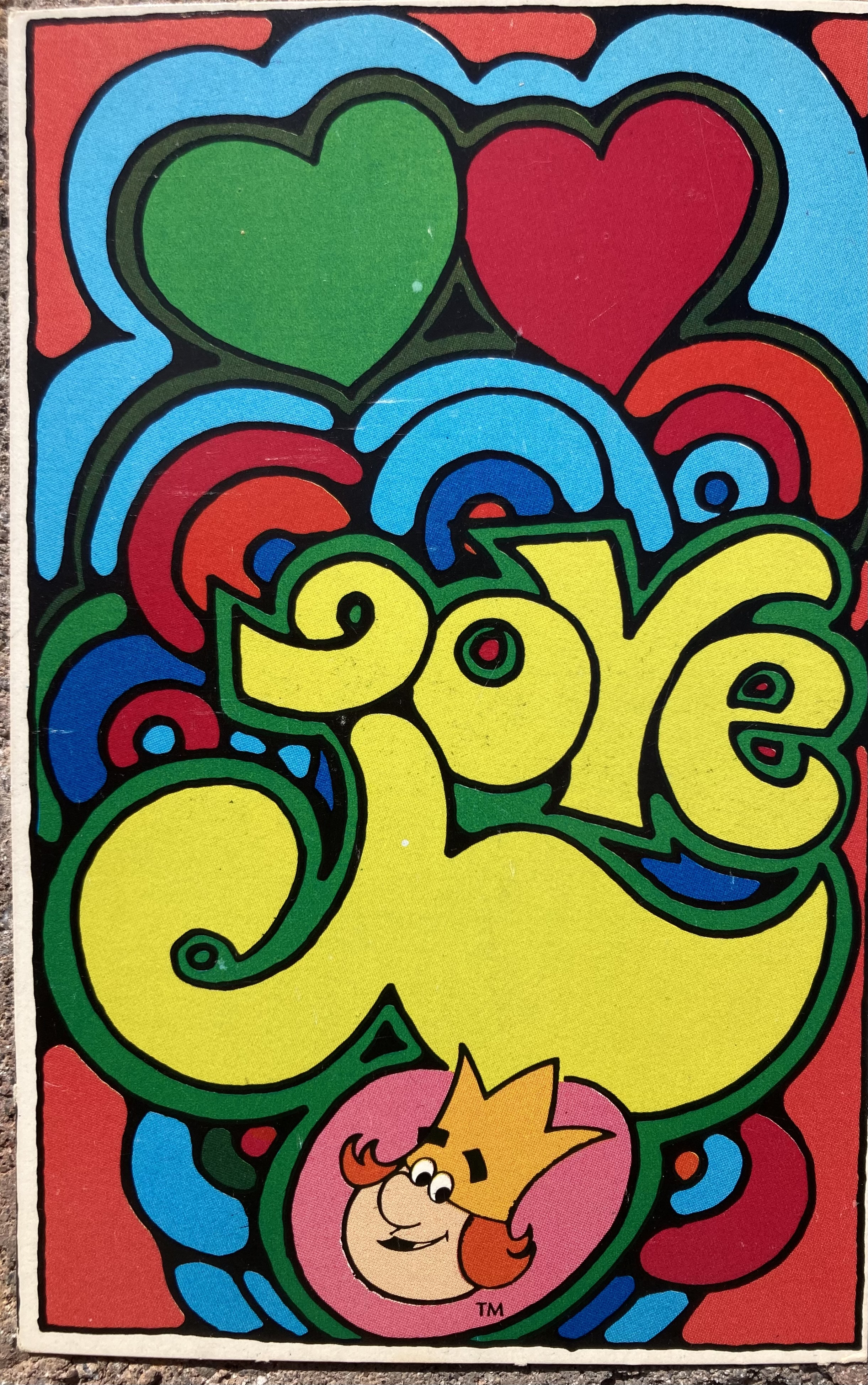
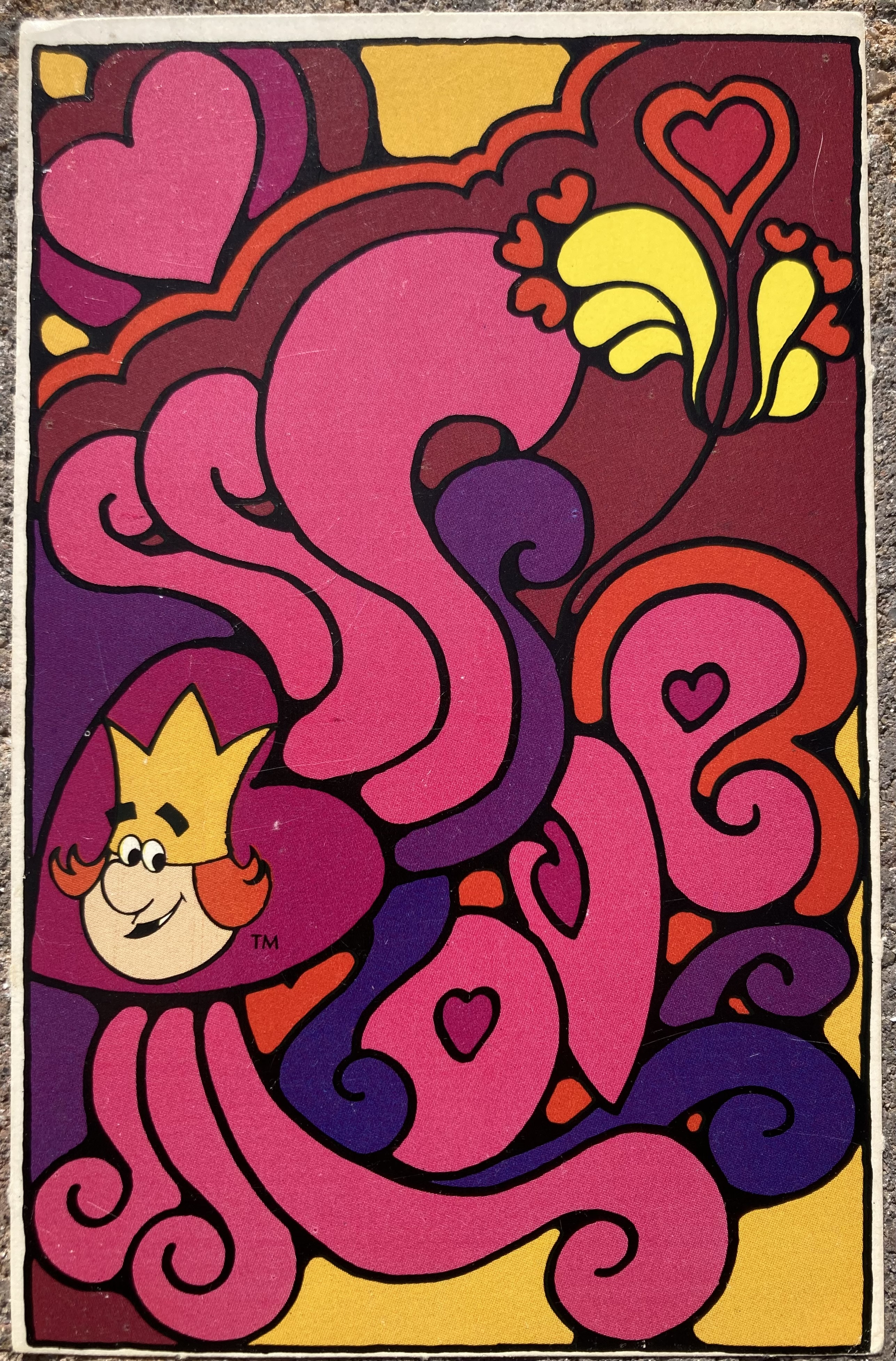
Burger King's 1972 "Love" postcards

These psychedelic "love" postcards were given away to kids at Burger King restaurants in 1972. I believe there were a total of six designs, and the cards came in perforated sets. Beyond the winning idea that the postcards touted the important concept of love to Burger King's young customers, I greatly appreciate that postcards themselves — ephemera! — were considered a good giveaway item, rather than the pointless plastic toys that became ubiquitous in the 1980s and 1990s.

It's possible that this postcard giveaway was tied to Valentine's Day, which in my mind doesn't make it any less worthy of applause. There's actually not much information available online about the history of this giveaway item. Maybe I'm overthinking this teeny-tiny corner of fast-food history, but I'd like to know more. Whose idea was this? Who designed the cards? How many were printed? How were they received by the general public? Did anyone actually mail these? (Most of the postcards that survive a half-century later are blank.)

I did come across an interesting read about McDonald's mail-advertisement postcards by Hal Ottaway on PostcardHistory.net. But the history of these colorful Burger King love postcards seems to remain sadly unwritten. If you remember getting, sending or receiving any of these, please let us know in the comments!

Let me end by saying that these postcards clearly fit thematically within our household.

Sunday, July 31, 2022

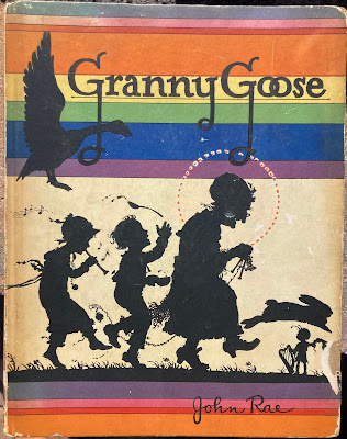
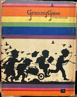
Colorful covers and endpapers of 1926's "Granny Goose"

Today's images are from my rough copy of 1926's Granny Goose, which was written and illustrated by John Rae (1882-1963) and published by P.F. Volland Company. (I previously featured Volland's trippy The Paper Dragon in 2019.)

This is Volland's statement on its "ideal" from the last page of the book:
"It is the Volland Ideal to give children only the best. Books for children should contain nothing to cause fright, suggest fear, glorify mischief, excuse malice or condone cruelty. That is why Volland books are called 'Books Good for Children.' Teachers, instructors, psychologists and parents endorse and recommend Volland Books as the most wholesome and inspiring juvenile literature — stories and verse that inspire; pictures that glow with beauty. Volland Books are graded; each contains a card telling for what age it is planned."
P.F. Volland was in business from 1909 to 1959 and was known for collaborating with dozens of outstanding artists/illustrators. Rae's work certainly falls into that category with this slim hardcover book, which measures 9¼ inches by 11¾ inches. As a minor aside, the cover calls the book Granny Goose and the title page calls it Granny Goose! with an exclamation point.

Here's a look at the endpapers, which don't scrimp on the geese.
The verses featured in the book (which is more than 50% illustrations) include mentions of King Kittery Kottle, Saint Wittery Wattle, Benjamin Bottle, Dobbeley Hobbeley Cobbeley Cory, Billy Bragg, Ned Willings, Burberry Biddle, Kirley McHugh, Tibby Tuppets, Molly Mopperty, Billings Bridge, John O'Groat, Tumbletown, Whipsy-ma-diddle, Old Johnny Bumble Buckely-Knees and Betty Battle. Some of those names/phrases are familiar, but others seem to have sprung from John Rae's wonderful imagination. There are also many good band names in the above list.

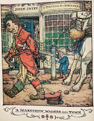
Here's a look at a couple of the interior illustrations.
The scarecrow is actually a bit on the creepy side, as is the verse that accompanies the illustration. It involves a scarecrow strolling into town, the snow turning black, bright-red hail falling from the sky and the awakening of a withery witch who comes running with a slashing switch. How, exactly, does this fit in with Volland's pledge that "books for children should contain nothing to cause fright (or) suggest fear"?